信息可視化研究綜述
2014-08-25 05:48:33楊彥波祁明月
河北科技大學學報 2014年1期
楊彥波,劉 濱,祁明月
(1.河北科技大學經濟管理學院,河北石家莊 050018;2.河北省軍區通信站,河北石家莊 050011)
信息可視化研究綜述
楊彥波1,劉 濱1,祁明月2
(1.河北科技大學經濟管理學院,河北石家莊 050018;2.河北省軍區通信站,河北石家莊 050011)
信息可視化是可視化技術在非空間數據領域的應用,可以增強數據呈現效果,讓用戶以直觀交互的方式實現對數據的觀察和瀏覽,從而發現數據中隱藏的特征、關系和模式。可視化應用非常廣泛,主要涉及領域:數據挖掘可視化、網絡數據可視化、社交可視化、交通可視化、文本可視化、生物醫藥可視化等等。根據CARD可視化模型可以將信息可視化的過程分為以下幾個階段:數據預處理;繪制;顯示和交互。根據SHNEIDERMAN的分類,信息可視化的數據分為以下幾類:一維數據、二維數據、三維數據、多維數據、時態數據、層次數據和網絡數據。其中針對后4種數據的可視化是當前研究的熱點。
多維數據可視化方法主要包括基于幾何的方法、圖標方法和動畫方法等。基于幾何的可視化方式中最經典的就是“平行坐標系”方法。平行坐標系(parallel coordinates)使用平行的豎直軸線來代表維度,通過在軸上刻劃多維數據的數值并用折線相連某一數據項在所有軸上的坐標點展示多維數據。平行坐標系方法能夠簡潔、快速地展示多維數據,發展出很多改進技術。但是當數據集的規模變得非常大時,密集的折線會引起“視覺混淆”(visual clutter),處理方法包括維度重排、交互方法、聚類、過濾、動畫等。其他基于幾何的方法包括Radviz方法使用圓形坐標系展示可視化結果;散點圖矩陣(scatter plot matrix)將多維數據中的各個維度兩兩組合繪制成一系列的按規律排列的散點圖。基于圖標的可視化方法用具備可視特征的幾何形狀如大小、長度、形狀、顏色等刻劃數據,代表性的方法包括星繪法和Chernoff 面法等。動畫方法用于可視化中可被用來提高交互性和理解程度,其缺點包括可能分散注意力、引起用戶的誤解、產生“圖表垃圾”等。
時間序列數據是指具有時間屬性的數據集,針對時間序列數據的可視化方法如下:線形圖、堆積圖、動畫、地平線圖、時間線。
層次數據具有等級或層級關系。層次數據的可視化方法主要包括節點鏈接圖和樹圖2種方式。其中樹圖(treemap)由一系列的嵌套環、塊來展示層次數據。為了能展示更多的節點內容,一些基于“焦點+上下文”技術的交互方法被開發出來。包括“魚眼”技術、幾何變形、語義縮放、遠離焦點的節點聚類技術等。
網絡數據具有網狀結構。自動布局算法是網絡數據可視化的核心,目前主要有以下3類:一是力導向布局(force-directed layout);二是分層布局(hierarchical layout);三是網格布局(grid layout)。當數據節點的連接很多時,容易產生邊交叉現象,導致視覺混淆。解決邊交叉現象的集束邊(edge bundle)技術可以分為以下幾類:力導向的集束邊技術、層次集束邊技術、基于幾何的邊聚類技術、多層凝聚集束邊技術和基于網格的方法等。
其他研究熱點包括圖形的視覺因素研究、自適應可視化研究、可視化效果的評估等。
視覺因素對于可視化效果的影響,如位置、長度、面積、形狀、色彩等影響已經引起很多研究者的注意。色彩是視覺因素的重要組成部分,研究主要集中在顏色選擇的原則和交互系統中。這些原則基于數據類型、類的數量、認知約束等。
自適應可視化可以提高信息可視化的適應性。研究成果分為以下幾類:自適應可視化展示、自適應資源模型、自適應用戶模型。自適應可視化展示是指根據用戶的特征自動為用戶提供多種展示類型,自動選擇可視化內容及布局的形式,自動調整可視化的元素等。自適應資源模型反映了對硬件和軟件的利用以提高可視化性能。自適應用戶模型通過顯示用戶模型的內容并讓用戶能夠編輯,從而讓用戶能夠控制模型的內容。
當前關于信息可視化評價的研究較少,少量研究也沒有提出直接和通用的可視化的評估方式,需要對信息可視化評價的理論基礎、方法和應用做深入的研究。
可視化技術與應用還應該繼續向以下4個方面努力:直觀化、關聯化、藝術化、交互化。信息可視化技術的發展方向是協同(collaboration)、分析過程(analytics)、計算(computational)和意會(sense-making)。未來研究方向可以包括以下幾個內容。
信息可視化和數據挖掘的緊密結合。為提高處理海量數據時的速度和效率和解決視覺混淆現象;必須運用數據挖掘的公式和算法,對數據分析的過程及結果進行可視化展現。
協同可視化。協同可視化領域的研究方向可以包括可視化接口設計、基于Web的可視化協同平臺開發、協同可視化工作的視圖設計、協同可視化中的工作流管理及協同可視化技術的應用等。
更多領域的應用技術開發。包括統計可視化:需要研究使用幾何、動畫、圖像等工具對數據統計的過程和結果進行加工和處理的技術;新聞可視化:對新聞內容進行抓取、清洗和提取和可視化展示;社交網絡可視化:可視化方式顯示社交網絡的數據,對社交網絡中節點、關系及時空數據的集成展示。搜索日志可視化:針對在使用搜索引擎時產生的海量搜索日志,可視化的展現用戶的搜索行為、關系和模式等。
信息可視化;可視化技術;人機交互;數據挖掘
可視化技術起源于20世紀80年代出現的科學計算可視化[1]。“信息可視化”一詞最早出現在ROBERTSON等1989 年發表的文章《用于交互性用戶界面的認知協處理器》中[2]。信息可視化是可視化技術在非空間數據領域的應用,是將數據信息轉化為視覺形式的過程,可以增強數據呈現效果,讓用戶以直觀交互的方式實現對數據的觀察和瀏覽,從而發現數據中隱藏的特征、關系和模式。信息可視化的圖表形式最早出現于18世紀,歷史和政治學家PLAYFAIR和數學家LAMBERT首次創建了可視化圖表,他們認為將復雜的數據轉化為圖表可以幫助人們了解數據。19世紀的法國科學家MINARD和MAREY首次采用非純手工方式繪制了圖表[3]。進入20世紀,現在計算機技術的進步拓展了數據處理的能力并且可以提供多種交互方式,使得用戶可以更便利的觀察自己感興趣的數據,可視化應用也更加廣泛,主要領域涉及數據挖掘可視化、網絡數據可視化、社交可視化、交通可視化、文本可視化、生物醫藥可視化等。
1 信息可視化的過程
1.1Card信息可視化模型
在CARD等提出的信息可視化模型中(見圖1),信息可視化過程可以劃分為3個數據轉換的過程:原始數據到數據表的轉換、數據表到可視化結構的轉換、可視化結構到視圖的轉換[4]。

圖1 Card信息可視化模型Fig.1 Card model of information visualization
1.2信息可視化過程
根據Card信息可視化模型可以將信息可視化的過程分為以下3個階段[5]。
1)數據預處理 數據預處理將采集來的信息進行預處理和加工,使其便于理解,易于被輸入顯示可視化模塊。預處理內容包括數據格式及其標準化、數據變換技術、數據壓縮和解壓縮等。有些數據也需要做異常值檢出、聚類、降維等處理。
2)繪制 繪制的功能是完成數據到幾何圖像的轉換。一個完整的圖形描述需要在考慮用戶需求的基礎上綜合應用各類可視化繪制技術。
3)顯示和交互 顯示的功能是將繪制模塊生成的圖像數據,按用戶指定的要求進行輸出。除了完成圖像信息輸出功能外,還需要把用戶的反饋信息傳送到軟件層中,以實現人機交互。針對可視化的主要任務,即總覽(overview)、縮放(zoom)、過濾(filter)、詳細查看(details-on-demand)、關聯(relate)等,交互技術主要包括動態過濾、全局+詳細、平移+縮放、焦點+上下文及變形、多視圖關聯協調等技術[6-7]。
2 信息可視化技術
根據SHNEIDERMAN的分類,信息可視化的數據分為以下幾類:一維數據;二維數據;三維數據;多維數據;時態數據;層次數據和網絡數據[8]。其中針對后4種數據的可視化是當前研究的熱點,本文將就這4種數據的可視化方法展開綜述。
2.1多維數據可視化技術
針對多維數據,采用傳統二維圖表方式難以有效滿足現代化的大量、復雜、多維度的信息需求。多維數據的可視化是當前研究的熱點之一。多維數據可視化的方法有很多種,本文主要綜述和討論有代表性的幾種方法。
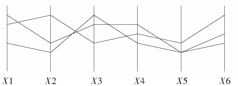
圖2 平行坐標系Fig.2 Parallel coordinates
2.1.1 基于幾何的可視化方式
1)平行坐標系 1980年,INSELBERG提出的平行坐標系(parallel coordinates)是經典的多維數據可視化技術之一(見圖2)[9]。平行坐標系使用平行的豎直軸線來代表維度,通過在軸上刻劃多維數據的數值并用折線相連某一數據項在所有軸上的坐標點,從而在二維空間內展示多維數據。
平行坐標系方法能夠簡潔、快速地展示多維數據。由于其經典性和廣泛應用性,許多學者將平行坐標系法應用于可視化、數據挖掘、過程控制、決策支持、近似計算和其他一些領域并獲得成功[10]。1990年INSELBERG首先將平行坐標系法用來解決可視化問題后[11],平行坐標系法也發展出很多改進技術[12],比如在不同層次上的平行坐標顯示[13],用曲線代替直線增強可視化效果等[14]。盛秀杰等使用平行坐標中的坐標軸和平行折線的可視化渲染方法提出了一種新的顏色漸變渲染方案[15]。SIIRTOLA提出利用數據子集的相關系數的平均數的方法動態畫出折線[16]。WONG等使用小波逼近方法建立的涂刷工具能夠展示不同分辨率下的線條構成[17]。Angular brushing可以讓用戶方便地選擇2個數軸之間的數據子集[18]。EdgeLens能夠在保證節點完好不變形的情況下交互地展示焦點區域中心的折線[19]。ZHOU等使用可視化聚類的方法調整折線的形狀[20]。
平行坐標可以進一步擴展到三維可視化的方式以展示高維動態的數據。很多專家也把平行坐標系和其他方法結合。SpringView整合了平行坐標系法和放射坐標系法來解決多維數據集。Parallel Glyphs將各個坐標軸擴展到星形圖的空間中以方便進行數據對比和提供交互[21]。
當數據集的規模變得非常大時,密集的折線會讓平行坐標系變得難以解釋。因此降低視覺混淆也被很多專家關注,基于平行坐標系的視覺混淆處理方法包括維度重排[22]、交互方法[20]、聚類[23]、過濾[24]、動畫[25]等。

圖3 Radviz方法Fig.3 Radviz method

圖4 散點圖矩陣Fig.4 Scatter plot matrix
2)Radviz方法 Radviz(radial coordinate visualization)使用圓形坐標系展示可視化結果(見圖3),圓形的k條半徑表示k維空間,通過引入物理學中物體受力平衡定理,將多維數據對象表示為坐標系內的一個點,點的位置使用彈簧模型計算得到[26]。Radviz的優缺點同平行坐標系類似,當數據規模很大時,也容易產生視覺混淆現象,影響用戶對于可視化結果的認知。
3)散點圖矩陣 散點圖通過二維坐標系中的一組點來展示2個變量之間的關系,散點圖矩陣(scatter plot matrix)就是將多維數據中的各個維度兩兩組合繪制成一系列的按規律排列的散點圖(見圖4)。散點圖矩陣也經常和其他可視化方法結合來增強顯示多維數據效果,基于散點圖矩陣的開發的連續的散點圖可以對海量數據進行可視化展示,CRAIG等研究了傳統的時間序列圖和散點圖的互補關系[27],SCHMID等整合了散點圖矩陣、平行坐標系、Addrews曲線來展示多維數據[28]。散點圖矩陣的優點主要是能快速發現成對變量之間的關系,缺點是當數據維度太大時,屏幕的大小會限制顯示矩陣元素的數量,需要結合交互技術來實現用戶對可視化結果的觀察。

圖5 Andrews曲線Fig.5 Andrews curve
4)Andrews 曲線法 Andrews曲線法(見圖5)使用二維坐標系展示可視化結果,將多維數據的每一數據項通過一個周期函數映射到二維坐標系中的一條曲線上[29],通過對曲線的觀察,用戶能夠感知數據的聚類等狀況。
2.1.2 基于圖標的可視化方式
基于圖標的可視化方法用具備可視特征的幾何形狀作為圖標來刻劃多維數據,這些圖標的每一個可視化屬性如大小、長度、形狀、顏色可以作為維度,通過多維數據到這些圖標屬性的映射來實現可視化效果,代表性的方法包括星繪法(見圖6)和Chernoff 面法(見圖7)等。星繪法采用由一點向外輻射的多條線段代表數據維度,不同的線段長度代表了每一個數據項的不同維度的值。Chernoff 面法使用人臉的大小、形狀和臉部器官的特征來代表數據維度,通過人臉繪制的多維數據按一定的策略進行排序,可以實現數據的可視化展示[30]。Chernoff 面法因為在展現上比其他圖形技術更有趣,所以觀察者愿意花更多的時間去分析,因此展現可能會更有效,Chernoff 面法也有利于高效識別各個要素之間的關系或模式[31]。
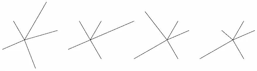
圖6 星繪法Fig.6 Star graph

圖7 Chernoff 面法Fig.7 Chernoff face
2.1.3 動畫的多維可視化技術研究現狀
由于具有直觀和引人入勝的特點,動畫已經被廣泛應用于用戶界面中。文獻表明,動畫可被用來提高交互性和理解程度:1)運動的物體能夠有效的吸引人們的注意力;2)動畫能展現對象的漸變[32],包括位置、大小、形狀、顏色的變化,從而讓人能自然地感覺到對象的變化;3)動畫可以提高用戶對因果關系和指向性的感知;4)動畫可以提升用戶的興趣度,讓用戶能更享受瀏覽過程[33]。
如何設計動畫以方便用戶的理解是研究的熱點之一。一種方法是在對數據進行編碼時使用動作作為一個附加的視覺變量。另一種方法是利用動畫使不同狀態下的轉換容易理解,如樹圖可視化中動畫轉換的應用。錐樹在樹的多個層次上利用動畫的旋轉使選定的項目進入觀察者的視野[34]。SpaceTrees和DOITrees利用動畫動態地展示樹的枝葉展開和折疊的情形。動畫也被應用于統計圖表中[35-36]。The Name Voyager基于Many Eyes技術在堆疊面積圖中使用動畫的方式展現尺度、網格線和軸標簽的變化[37]。BUSH等使用動畫介紹和分析統計圖,包括數據標記的動態展現、從堆積面積圖到散點圖變形和轉換等[38]。
有一些專家也指出了動畫的缺點。如動畫可能分散注意力、動畫的在對象轉換的過程中可能會引起用戶的誤解,可能用戶注意“圖表垃圾”(不相關的信息和無價值的信息)[39]。另外,如果動畫速度太慢會浪費時間,動畫速度太快會導致理解錯誤,但動畫的最佳速度由于場景復雜性和用戶的背景很難確定。因此,對于動畫的使用必須慎重。
2.2時間序列數據的可視化
時間序列數據是指具有時間屬性的數據集,針對時間序列數據的可視化方法如下。
1)線形圖 線形圖是時間序列可視化中最普通的方式,使用點的位置代表時間發展和數據值。對于有多個時間維度的數據可以為每一個時間維建立一個圖表,可以讓圖表垂直和水平對齊,以幫助進行事件的趨勢比較。
2)堆積圖 堆積圖是對時間序列數據累積形式的展現,可以觀察序列的總和。堆積圖雖然能夠有效地顯示序列總和模式,但是缺乏每個序列的比較,處理含有負值的數據也較差。

圖8 地平線圖Fig.8 Horizon graph
3)動畫 和靜態圖片相比,動畫方式更能展現時間序列的變化情況。但是動畫精確顯示數值的能力較差。
4)地平線圖 地平線圖能夠展現數據的變化率隨時間的演變情況,并且可以使用顏色來加深正向變動和負向變動的效果(見圖8)。SAITO等首次提出地平線圖技術[40],HEER等進一步發展了這項技術[41]。

圖9 iPhone發展時間線Fig.9 Timeline of iPhone3
5)時間線 時間線(Timeline)是指以時間軸為水平軸線,將數據信息以圖標或圖片的形式按時間順序置于水平軸坐標系內。1765年,PRIESTLEY用時間線的方法描述了從公元前1200年到公元1750年間的2 000位著名人士的生命期內的事件。時間線也被用在了醫療記錄和犯罪記錄中,最著名的是Lifelines。Lifelines 使用時間線展示人的歷史醫療情況,并且可以點擊事件點查看詳細的信息。The Pattern Finder是Lifelines的發展,用于多維數據的可視化挖掘中[42]。時間線的最主要的問題就是由于時間范圍過長從而難以在長度有限的時間軸上全面展示重要的信息細節。為了解決這個問題,SPENCE基于“焦點+上下文”技術提出的“Bifocal Lens”方法可以從語義上壓縮顯示邊緣的顯示項目[43]。MACKINLAY等提出了另一種基于“焦點+上下文”技術的方法“Perspective Wall”使用透視方法壓縮顯示邊緣的信息[44]。將不同時間線聯系起來也能展現更復雜的關系。JENSEN通過將多維時間軸能夠堆疊和鏈接的方式來展現不同時間線的事件之間的關系[45]。如iPhone發展時間線見圖9。
2.3層次數據的可視化
層次數據是常見的數據類型,可以用來描述生命物種、組織結構、家庭關系、社會網絡等具有等級或層級關系的對象。層次數據的可視化方法主要包括節點鏈接圖和樹圖2種方式。

圖10 節點鏈接圖Fig.10 Link point graph

圖11 樹圖Fig.11 Treemap4
1)節點鏈接圖 節點鏈接圖[46]是將層次數據組織成一個類似于樹的節點的連接結構,畫出節點和連線來代表數據項和它們之間的關系,節點通常是一些小點從而難以包含更多的信息(見圖10)。節點鏈接圖能清晰直觀地展現層次數據內的關系,但是分支間的空白會浪費展示空間,當數據量較大時,分支很快就會擁擠交織在一起,變得混亂不堪,造成視覺混淆現象。
2)樹圖 樹圖(treemap)最早由JOHNSON等在1991年提出[47]。樹圖一系列的嵌套環、塊來展示層次數據,樹圖能夠在有限的空間內展示大量數據,但是也無法展示節點的細節內容(見圖11)。為了能展示更多的節點內容,一些基于“焦點+上下文”技術的交互方法被開發出來。包括“魚眼”技術、幾何變形、語義縮放、遠離焦點的節點聚類技術等[48]。
2.4網絡數據可視化
網絡數據具有網狀結構,如互聯網網絡、社交網絡、合作網絡及傳播網絡等。自動布局算法是網絡數據可視化的核心,目前主要有以下3類:一是仿真物理學中力的概念來繪制網狀圖,即力導向布局(force-directed layout);二是分層布局(hierarchical layout);三是網格布局(grid layout)。很多研究是基于以上布局算法的應用或者是對以上算法的進一步優化。在網絡數據的可視化中,當數據節點的連接很多時,容易產生邊交叉現象,導致視覺混淆。解決邊交叉現象的集束邊(edge bundle)技術可以分為以下幾類:力導向的集束邊技術、層次集束邊技術、基于幾何的邊聚類技術、多層凝聚集束邊技術和基于網格的方法等[49]。
3 其他研究熱點
3.1可視化圖形的視覺因素研究
視覺因素對于可視化效果的影響,如位置、長度、面積、形狀、色彩等影響已經引起很多研究者的注意。評估視覺因素對于用戶感知的影響,使設計人員能夠優化可視化效果,是可視化過程中的重點之一。BERTIN首次進行了系統的實驗[50],研究了視覺要素在名義、序列和度量數據可視化中的效果,CLEVELAND等采用基于人類的主觀認知的科學實驗測試了可視化要素的影響[51]。SIMKIN等測試了人類對條形圖和餅形圖的認知差異[52]。其他研究包括圖表的縱橫比研究[53]、數據軸的設計[54]、色彩選擇等。
色彩是視覺因素的重要組成部分,研究成果也較豐富。研究主要集中在顏色選擇的原則和交互系統中。這些原則基于數據類型、類的數量、認知約束等。PRAVDAColor和ColorBrewer都根據數據類型來配置可視化效果中的色彩[55-56]。MEIER等使用藝術色彩理論來設計交互色彩的選擇[57]。COHEN-Or等使用同樣理論在圖片組合中提升色彩的和諧度[58]。色彩的交互研究主要集中在顏色繪圖基于空間頻率[49],認知清晰度,色彩協調[59],和顯示能量消耗[60]。
其他學者也從不同方面研究了色彩的應用,研究了如何為單詞和短語配置色彩。一些學者采用統計模型(如LDA,latent dirichlet allocation模型等)研究了人類對色彩名字的判斷模式,設計的工具允許用戶操縱色彩映射以直觀地搜索和過濾數據[61]。
3.2自適應可視化研究

圖12 自適應可視化模型Fig.12 Model of adaptive visualization
自適應可視化可以提高信息可視化的適應性,如依據對用戶行為分析后得出的用戶特征來自動調整可視化形式,從而提高可視化結果的針對性。通過自適應可視化技術,能夠為用戶調整可視化的要素和方式[62]。一些學者的研究成果分為以下幾類:自適應可視化展示、自適應資源模型、自適應用戶模型(見圖12)[63-64]。
1)自適應可視化展示 自適應可視化展示是指根據用戶的特征自動為用戶提供多種展示類型,自動選擇進行可視化內容及布局的形式,自動調整可視化的元素如顏色和圖標等。ERST(external representation selection tutor)根據用戶背景知識和任務類型提供信息展示方式的選擇集[65];Opinion Space讓用戶更容易在高維空間內看到他們的觀點[66];GANSNER等使用FDP(force directed placement)提出基于顏色配置變化的自適應方法[67],KnowledgeSea使用SOM算法通過改變前景色和背景色、圖標等元素來可視化展現教育的內容[68]。
2)自適應資源模型 自適應資源模型反映了對硬件和軟件的利用以提高可視化性能。MEYER等開發了一種能夠自動利用網絡中多個服務器的計算機資源的實時優化控制技術來提高交互可視化的性能[69]。GALLOP等提出用于支持分布環境下協同工作的面向組件的自適應協同可視化技術[70]。LIU等研究了計算機負荷情況可視化過程的影響[71]。
3)自適應用戶模型 自適應用戶模型通過顯示用戶模型的內容并讓用戶能夠編輯,從而讓用戶能夠控制模型的內容。BRUSILOVSKY提出了如何建立用戶模型[72]。WOJCJECH等開發了根據用戶搜索結果的屬性及用戶的相關信息來自適應地選擇相應界面的方法[73]。YourNews提供用戶模型的觀察和編輯功能。IntrospectiveView使用本體模型,根據用戶的不同提供不同顏色和字體[74]。MyExperiences引入開放學習模型(OLM),從而允許用戶建構自己的模型[75]。
上述自適應可視化策略仍然多是靜態的,缺乏交互性,難以幫助用戶學習并理解復雜的信息需求[76]。
3.3可視化效果的評估
MORSE等指出當前關于信息可視化評價的研究較少,少量研究也沒有提出直接和通用的可視化的評估方式[77]。MEYER指出沒有普遍接受的關于最優數據展示的標準,部分原因在于缺乏實證證據和可視化方法種類太多[78]。PURCHASE認為評估只是根據美學因素或計算效率評價可視化是不可取的,而是應該考慮可視化對用戶績效的提升能力。研究表明界面的美學特質和績效之間的關系是復雜的[79]。雖然美學因素經常和感知易用性相聯系,但是感知易用性和實際的可用性可能是不相關的。另一學者主張使用表現力(expressiveness) 和有效性(effectiveness) 兩個標準來評價信息可視化的效果。如FREITAS提出的認知復雜度(cognitive complexity) 和空間組織(spatial organization) 2個標準[80]。
一些學者專注于特定領域的可視化的評估。DOWELL等認為這些評價是針對特殊領域的評價,其推廣性較差[81]。一個更直接更普通的評價方法是應用認知心理學理論,使用不同的可視化方法向被實驗者展示問題,通過評估回答的精確性、信心和花費時間等項目比較不同可視化方法的績效[82]。
總體來說,信息可視化的評價方法和體系吸引了一些學者的注意,但是研究成果還是少量和滯后的,因此需要對信息可視化評價的理論基礎、方法和應用做深入的研究[83]。
4 結 語
上述資料表明:信息可視化研究已經取得了一些很有意義的成果,尤其是在可視化技術與可視化認知方面積累了大量經驗,也進行了許多新的嘗試。根據信息可視化的十大原則[84],可視化技術與應用還應該繼續向以下4個方面努力:直觀化:直觀、形象地呈現數據;關聯化:挖掘、突出呈現數據之間的關聯;藝術化:增強數據呈現的藝術效果,符合審美規則;交互化:增強人機交互,實現即時數據操作。戴國忠等認為數據可視化技術的發展方向是協同(collaboration)、分析過程(analytics)、計算(computational)和意會(sense-making)[85]。信息可視化未來研究方向可以包括以下幾個內容。
1)信息可視化和數據挖掘的緊密結合 對于大數據的定義一直在不斷地增長。現在網絡和很多企業的數據量都達到了TB級別。[86]可視化技術在處理海量數據時的速度和效率是值得關注的第一個問題;第二問題是傳統的可視化技術在面對多維度和大數據量時不可避免的造成視覺混亂(visual clutter)現象;非結構化數據,尤其是異構的、非結構化的混雜數據的出現,對信息可視化提出了另一個大挑戰,因此必須緊密結合信息可視化和數據挖掘技術,運用數據挖掘的公式和算法,對數據分析的過程及結果進行可視化展現,讓用戶可以方便高效的操作海量數據,以發現隱含信息,從而引導出新的預見和更高效的決策。
2)協同可視化 由于海量數據的出現和技術方法的復雜性,信息可視化需要由多成員、多團隊的開發來完成,因此需要創造協同可視化環境,利用合理的數據分布使得多個工作站之間實現資源共享,對于可視化的過程進行同步和異步控制,利用并行性來獲得極高的加速比,從而解決多個研究工作者間的協同性問題。協同可視化領域的研究方向可以包括可視化接口設計、基于web的可視化協同平臺開發、協同可視化工作的視圖設計、協同可視化中的工作流管理、及協同可視化技術的應用等。
3)更多領域的應用技術 信息可視化的方法和技術已經應用到了越來越多的領域,同時這些領域內的應用也為可視化技術的完善和發展提供良好的環境,當前和未來信息可視化應用的熱點領域包括以下4個方面。
統計可視化:需要研究使用幾何、動畫、圖像等工具對數據統計的過程和結果進行加工和處理的技術。
新聞可視化:通過對新聞內容進行抓取、清洗和提取和可視化展示,讓繁雜的信息有據可依、有線可尋、有圖可索,讓信息傳播更直觀、更生動、更快捷。
社交網絡可視化:通過可視化方式顯示社交網絡的數據,通過對社交網絡中節點、關系及時空數據的集成,有效揭示社交網絡的關聯、比較、走勢關系。
搜索日志可視化:針對在使用搜索引擎時產生的海量搜索日志,可視化的展現用戶的搜索行為、用戶與信息化環境的交互模式、用戶與用戶之間的交互關系,獲取用戶的需求和關系模式。
/
[1] DEFANTI T A, BROWN M D, MCCORMICK B H. Visualization:Expanding scientific and engineering research opportunities[J]. Computer, 1989,22(8) : 12-16.
[2] ROBERTSON G, CARD S K, MACKINLAY J D. The cognitive coprocessor architecture for interactive user interfaces[A]. Proceedings of the 2nd Annual ACM SIGGRAPH Symposium on User interface Software and Technology[C]. New York: ACM, 1989. 10-18.
[3] SINDIY O, LITOMISKY K, DAVIDOFF S, et al. Introduction to information visualization (InfoVis) techniques for Model-Based systems engineering[J]. Procedia Computer Science, 2013(16): 49-58.
[4] CARD S K, MACKINLAY J D, SHNEIDERMAN B. Readings in Information Visualization: Using Vision to Think[M]. San Francisco: Morgan Kaufmann, 1999.
[5] 陳建軍,于志強,朱 昀. 數據可視化技術及其應用[J]. 紅外與激光工程, 2001,30(5): 339-342. CHEN Jianjun, YU Zhijiang, ZHU Yun. Data visualization and its applications[J]. Infrared and Laser Engineering, 2001,30(5):339-342.
[6] 任 磊,王威信,周明駿,等. 一種模型驅動的交互式信息可視化開發方法[J]. 軟件學報,2008,19(8): 1947-1967. REN Lei, WANG Weixin, ZHOU Mingjun, et al. A model driven development method for interactive information visualization[J]. Journal of Software, 2008, 19(8):1947-1967.
[7] 劉大海. 海量數據可視化方法的研究[D]. 天津:天津大學,2009. LIU Dahai. The Research of Large-scale Data Visualization[D]. Tianjin: Tianjin University, 2009.
[8] SHNEIDERMAN B. The eyes have it: A task by data type taxonomy for information visualizations[A]. Proceedings of the 1996 IEEE Symposium on Visual Languages[C]. Washington DC: IEEE Computer Society, 1996. 336-343.
[9] INSELBERG A. The plane with parallel coordinates[J]. The Visual Computer, 1985, 1(2):69-91.
[10] 孫 揚,封孝生,唐九陽,等.多維可視化技術綜述[J].計算機科學,2008, 35(11):1-7. SUN Yang, FENG Xiaosheng, TANG Jiuyang, et al. Survey on the research of multidimensional and multivariate data visualization[J]. Computer Science, 2008, 35(11): 1-7.
[11] INSELBERG A, DIMSDALE B. Parallel coordinates[A]. Human-Machine Interactive Systems[C]. Berlin: Springer, 1991.199-233.
[12] 楊 峰,李月華.高維信息可視化方法研究綜述[J].情報理論與實踐,2012, 35(9):125-128. YANG Feng, LI Yuehua. Review of multidimensional information visualization[J]. Information Studies: Theory & Application, 2012, 35(9): 125-128.
[13] FUA Y H, WARD M O, RUNDENSTEINER E A. Hierarchical parallel coordinates for exploration of large datasets[A]. Proceedings of the Conference on Visualization’99: Celebrating Ten Years[C]. Los Alamitos: IEEE Computer Society Press, 1999.443-508.
[14] GRAHAM M, KENNEDY J. Using curves to enhance parallel coordinate visualizations[A]. Proceedings of the Seventh International Conference on Information Visualization[C]. Washington DC: IEEE Computer Society, 2003. 10-16.
[15] 盛秀杰,金之鈞,王義剛.一種新的面向多元統計分析的信息可視化技術[J].石油地球物理勘探,2013, 48(3):488-496. SHENG Xiujie, JIN Zhijun, WANG Yigang. A novel information visualization approach for multiple statistical analysis[J]. Oil Geophysical Prospecting, 2013, 48(3): 488-496.
[16] SIIRTOLA H. Direct manipulation of parallel coordinates[A]. CHI’00 Extended Abstracts on Human Factors in Computing Systems[C]. New York: ACM, 2000. 373-378.
[17] WONG P C, BERGERON R D. Multiresolution multidimensional wavelet brushing[A]. Proceedings of the 7th Conference on Visualization’96[C]. Los Alamitos: IEEE Computer Society Press, 1996. 141-148.
[18] HAUSER H, LEDERMANN F, DOLEISCH H. Angular brushing of extended parallel coordinates[A]. IEEE Symposium on Information Visualization 2002[C].Washington DC: IEEE Computer Society, 2002. 127-130.
[19] WONG N, CARPENDALE S, GREENBERG S. Edge lens: An interactive method for managing edge congestion in graphs[A]. Proceedings of the IEEE Symposium on Information Visualization (InfoVis’02)[C]. Washington DC: IEEE Computer Society, 2002. 51-58.
[20] ZHOU H, YUAN X R, QU H M, et al. Visual clustering in parallel coordinates[J]. Computer Graphics Forum, 2008, 27(3): 1047-1054.
[21] BERTINI E, DELL L, SANTUCCI G. SpringView: Cooperation of radviz and parallel coordinates for view optimization and clutter reduction[A]. Proceedings of the Coordinated and Multiple Views in Exploratory Visualization[C].Washington DC: IEEE Computer Society, 2005.22-29.
[22] YANG J, PENG W, WARD M O, et al. Interactive hierarchical dimension ordering, spacing and filtering for exploration of high dimensional datasets[A]. Proceedings of the Ninth annual IEEE Conference on Information visualization[C].Washington DC: IEEE Computer Society, 2003. 105-112.
[23] JOHANSSON J, LJUNG P, JERN M, et al. Revealing structure within clustered parallel coordinates displays[A]. Proceedings of the 2005 IEEE Symposium on Information Visualization[C]. Washington DC: IEEE Computer Society, 2005. 125-132.
[24] JOHANSSON J, COOPER M. A screen space quality method for data abstraction[J]. Computer Graphics Forum, 2008, 27(3):1039-1046.
[25] SHEARER J, OGAWA M, KWAN-LIU M, et al. Pixelplexing: Gaining display resolution through time[A]. IEEE Pacific Visualization Symposium[C]. Washington DC: IEEE Computer Society, 2008. 159-166.
[26] KANDOGAN E. Visualizing multi-dimensional clusters, trends, and outliers using star coordinates[A]. Proceedings of the Seventh ACM SIGKDD International Conference on Knowledge Discovery and Data Mining[C]. New York: ACM, 2001. 107-116.
[27] CRAIG P, KENNEDY J. Coordinated graph and scatter-plot views for the visual exploration of microarray time-series data[A]. Proceedings of the Ninth Annual IEEE Conference on Information Visualization[C].Washington DC: IEEE Computer Society, 2003. 173-180.
[28] SCHMID C, HINTERBERGER H. Comparative multivariate visualization across conceptually different graphic displays[A]. Proceedings of the Seventh International Working Conference on Scientific and Statistical Database Management[C]. Washington DC: IEEE Computer Society, 1994. 42-51.
[29] ANDREWS D F. Plots of high dimensional data[J]. International Journal of Biometrics, 1972, 28(1): 125-136.
[30] CHERNOFF H. The use of faces to represent points in k-dimensional space graphically[J]. Journal of the American Statistical Association, 1973(68): 361-368.
[31] LEE M D, BUTAVICIUS M A, REILLY R E. Visualizations of binary data: A comparative evaluation[J]. International Journal of Human-computer Studies, 2003, 59(5): 569-602.
[32] ROBERTSON G G, MACKINLAY J D, CARD S K. Cone trees: animated 3D visualizations of hierarchical information[A]. Proceedings of the SIGCHI Conference on Human Factors in Computing Systems[C]. New York: ACM, 1991.189-194.
[33] HEER J, ROBERTSON G G. Animated transitions in statistical data graphics[J]. IEEE transaction on Visualization and Computer Graphics, 2007, 13(6): 1240-1247.
[34] ROBERTSON G, CAMERON K, CZERWINSKI M, et al. Animated visualization of multiple intersecting hierarchies[J]. Journal of Information Visualization, 2002, 1(1): 50-65.
[35] PLAISANT C, GROSJEAN J, BEDERSON B B. Space tree: Supporting exploration in a large node-link tree, design evolution and empirical evaluation[A]. Proceedings of the IEEE Symposium on Information Visualization (InfoVis’02)[C].Washington DC: IEEE Computer Society, 2002.57-64.
[36] HEER J, CARD S K. DOITrees revisited: Scalable, space-constrained visualization of hierarchical data[A]. Proceedings of the Working conference on Advanced Visual Interfaces[C]. New York: ACM, 2004. 421-424.
[37] WATTENBERG M, KRISS J. Designing for social data analysis[J]. IEEE Trans on Visualization and Computer Graphics, 2006,12(4):549-557.
[38] BUSH S,MENZIES G,THORP S.An array of online teaching tools[J].Teaching Statistics,2009,31(1):17-20.
[39] TUFTE E. The Visual Display of Quantitative Information[M]. Cheshire: Graphics Press, 2001.
[40] SAITO T, MIYAMURA H N, YAMAMOTO M, et al. Two-tone pseudo-coloring: Compact visualization for one-dimensional data[A]. Proceedings of the 2005 IEEE Symposium on Information Visualization[C]. Washington DC: IEEE Computer Society, 2005. 173-180.
[41] HEER J, KONG N, AGRAWALA M. Sizing the horizon: The effects of chart size and layering on the graphical perception of time series visualizations[A]. Proceedings of the SIGCHI Conference on Human Factors in Computing Systems 2009[C]. New York: ACM, 2009. 1303-1312.
[42] KIM N W, CARD S K, HEER J. Tracing genealogical data with TimeNets[A]. Proceedings of the International Conference on Advanced Visual Interfaces[C]. New York: ACM, 2010.26-28.
[43] SPENCE R, APPERLEY M D. Database navigation: An office environment for the professional[J]. Behavior and Information Technology, 1982(1): 43-54.
[44] MACKINLAY J D, ROBERTSON G G, AND CARD S K. The perspective wall: Detail and context smoothly integrated[A]. Proceedings of the SIGCHI Conference on Human Factors in Computing Systems[C]. New York: ACM, 1991.173-176.
[45] JENSEN M. Visualizing Complex Semantic Timelines[R]. [S.l.]:[s.n.],2003.
[46] ROBERTSON G G, MACKINLAY J D, CARD S K. Cone trees:Animated 3D visualizations of hierarchical information[A]. Proceedings of the SIGCHI Conference on Human Factors in Computing Systems[C]. New York: ACM, 1991.189-194.
[47] 張 昕,袁曉如.樹圖可視化[J].計算機輔助設計與圖形學學報,2012, 24(9):1113-1124. ZHANG Xin, YUAN Xiaoru. Treemap visualization[J]. Journal of Computer-aided Design & Computer Graphics, 2012, 24(9): 1113-1124.
[48] CARD S K, SUH B, PENDLETON B A, et al. Time tree: Exploring time changing hierarchies[A]. 2006 IEEE Symposium on Visual Analytics Science and Technology[C].Washington DC: IEEE Computer Society, 2006. 3-10.
[49] SELASSIE D, HELLER B, HEER J. Divided edge bundling for directional network data[J]. IEEE Trans Visualization and Computer Graphics,2011,17(12):2354-2363.
[50] BERTIN J. Sémiologie Graphique[M]. Paris:University of Wisconsin Press, 1983.
[51] CLEVELAND W S, MCGILL R. Graphical perception: Theory, experimentation, and application to the development of graphical methods[J]. Journal of the American Statistical Association, 1984, 387 (79):531-554.
[52] SIMKIN D, HASTIE R. An information-processing analysis of graph perception[J]. Journal of the American Statistical Association, 1987, 398 (82):454-465.
[53] TALBOT J, LIN S, HANRAHAN P. An extension of Wilkinson's algorithm for positioning tick labels on axes[J]. IEEE Transactions on Visualization and Computer Graphics, 2010, 16(6): 1036-1043.
[54] HEER J, STONE M. Color naming models for color selection, image editing and palette design[A]. Proceedings of the SIGCHI Conference on Human Factors in Computing Systems[C]. New York: ACM, 2012. 1007-1016.
[55] BERGMAN L D, ROGOWITZ B E, TREINISH L A. A rule-based tool for assisting colormap selection[A]. Proceedings of the 6th conference on Visualization’95[C]. New York: ACM, 1995.118-125.
[56] HARROWER M, BREWER C.Colorbrewer org:An online tool for selecting color schemes for maps[J]. The Cartographic Journal, 2003, 40(1): 27-37.
[57] MEIER B J, SPALTER A M, KARELITZ D B. Interactive color palette tools[J]. IEEE Computer Graphics and Applications, 2004, 24(3): 64-72.
[58] COHEN-OR D, SORKINE O, GAL R. Color harmonization[J]. ACM Transactions on Graphics, 2006, 25(3):624-630.
[59] WANG L J, GIESEN J, MCDONNELL K T, et al. Color design for illustrative visualization[J]. Visualization and Computer Graphics, 2008, 14(6): 1739-1746.
[60] CHUANG J, WEISKOPF D, MOELLER T, et al. Energy aware color sets[J]. Computer Graphics Forum, 2009, 28(2): 203-211.
[61] LIN S, FORTUNA J, KULKARNI C, et al. Selecting semantically-resonant colors for data visualization[J]. Computer Graphics Forum, 2013,32(3).
[62] ROUSSINOV D, RAMSEY M. Information forage through adaptive visualization[A]. Proceedings of the Third ACM conference on Digital Libraries[C]. New York: ACM, 1998. 303-304.
[63] DOMIK G O, GUTKAUF B. User modeling for adaptive visualization systems[A]. Proceedings of the conference on Visualization’94[C]. Los Alamitos: IEEE Computer Society Press, 1994. 217-223.
[64] GRAWEMEYER B, COX R. A bayesian approach to modelling users' information display preferences[A]. Proceedings of the 10th International conference on User Modeling[C]. Berlin: Springer, 2005. 225-230.
[65] TERAOKA T, MARUYAMA M. Adaptive information visualization based on the user's multiple viewpoints-interactive 3D visualization of the WWW[A]. Proceedings of the 1997 IEEE Symposium on Information Visualization (InfoVis ’97)[C]. Washington DC: IEEE Computer Society,1997.25-28.
[66] BITTON E. A spatial model for collaborative filtering of comments in an online discussion forum[A]. 3rd ACM Conference on Recommender Systems[C]. New York: ACM, 2009. 393-396.
[67] GANSNER E, HU Y, KOBOUROV S, et al. Putting recommendations on the map: Visualizing clusters and relations[A]. Proceedings of the Third ACM Conference on Recommender Systems[C]. New York: ACM, 2009.345-348.
[68] BRUSILOVSKY P, RIZZO R. Using maps and landmarks for navigation between closed and open corpus hyperspace in web-based education[J]. New Review of Hypermedia and Multimedia, 2003, 8(1): 59-82.
[69] MEYER J, GELDER S, KRETSCHMER K, et al. Interactive visualization of hybrid medical data sets[A]. Proceeding of WSCG[C]. Plzen: University of West Bohemia Press, 1997. 371-380.
[70] GALLOP J R, BLAIR G S, COOPER C S, et al. Component-oriented approach to adaptive collaborative visualization[A]. Visualization and Data Analysis[C]. Bellingham: SPIE, 2002. 99-104.
[71] LIU H H, JI Q G. Research on adaptive rendering based on visual acuity equations[A]. Fourth International Conference on vVirtual Reality and Its Applications in Industry[C]. Bellingham: SPIE, 2004. 96-99.
[72] BRUSILOVSKY P. Methods and techniques of adaptive hypermedia[J]. User Modeling and User-adapted Interaction, 1996, 6(2/3): 87-129.
[73] WIZA W, WALCZAK K, CELLARY W. Periscope: A system for adaptive 3D visualization of search results[A]. Proceedings of the Ninth International Conference on 3D Web Technology[C]. New York: ACM, 2004. 29-40.
[74] BAKALOV F, K?NIG-RIES B, NAUERZ A, et al. IntrospectiveViews: An interface for scrutinizing semantic user models[A]. Proceedings of the 18th International Conference on User Modeling, Adaptation, and Personalization[C].Berlin: Springer, 2010.219-230.
[75] KUMP B, SEIFERT C, BEHAM G, et al. MyExperiences:Visualizing evidence in an open learner model[A]. Adjunct Proceedings of the 18th International Conference on User Modeling, Adaptation, and Personalization[C].Big Island HI:[s.n.], 2010.16-18.
[76] AHN J W, BRUSILOVSKY P, GRADY J, et al. Open user profiles for adaptive news systems: Help or harm[A]. Proceedings of the 16th International Conference on World Wide Web[C]. New York:ACM,2007.11-20.
[77] MORSE E, LEWIS M, OLSEN K A. Evaluating visualizations: Using a taxonomic guide[J]. International Journal of Human-computer Studies, 2000, 53(5): 637-662.
[78] MEYER J. Performance with tables and graphs: Effects of training and a visual search model[J]. Ergonomics, 2000, 43(11): 1840-1865.
[79] AHN J W, BRUSILOVSKY P. Adaptive visualization for exploratory information retrieval[J]. Information Processing & Management, 2013, 49(5): 1139-1164.
[80] FREITAS C M D S, LUZZARDI P R G, CAVA R A, et al. On evaluating information visualization techniques[A]. Proceedings of the Working Conference on Advanced Visual Interface[C]. New York: ACM, 2002.373-374.
[81] DOWELL J, LONG J. Conception of the cognitive engineering design problem[J]. Ergonomics, 1998, 41(2): 126-139.
[82] PURCHASE H C. The effects of graph layout[A]. Proceedings of the Australasian Conference on Computer Human Interaction[C]. Washington DC: IEEE Computer Society, 1998. 80-86.
[83] 楊 峰,李 蔚.評價信息可視化技術的指標研究[J].圖書情報知識,2007(4):80-84. YANG Feng, LI Wei. The research of indexes for evaluating information visualization techniques[J]. Document, Information & Knowledge, 2007(4): 80-84.
[84] KELLEHER C, WAGENER T. Ten guidelines for effective data visualization in scientific publications[J]. Environmental Modelling & Software , 2011,26:822-827.
[85] 戴國忠,陳 為,洪文學,等.信息可視化和可視分析:挑戰與機遇[J].中國科學,2013, 43(1):178-184. DAI Guozhong, CHEN Wei, HONG Wenxue, et al. Information visualization and visual analytics: Challenges and opportunities[J]. China Science, 2013, 43(1): 178-184
[86] 任永功,于 戈.數據可視化技術的研究與進展[J].計算機科學,2004, 31(12):92-96. REN Yonggong, YU Ge. Research and development of the data visualization techniques[J]. Computer Science, 2004, 31(12): 92-96.
Review of information visualization
YANG Yanbo1, LIU Bin1, QI Mingyue2
(1.School of Economics and Management, Hebei University of Science and Technology, Shijiazhuang Hebei 050018, China;2.Communication Station of Hebei Provincial Military Command, Shijiazhuang Hebei 050011, China)
Information visualization is the application of visualization technology in non-spatial data area, enhancing data presentation effect.Users can observe the data intuitively and interactively so as to find implicit features, relations and patterns in data. The application of information visualization is very abroad which includes data mining visualization, network data visualization, social data visualization, traffic visualization, text visualization, and medicine visualization, etc. According to Card model on information visualization, process of information visualization includes three stages:data pretreating, data plotting, data displaying and interacting.Ben Shneiderman notes that visualization data includes one-dimensional data, two-dimensional data, three-dimensional data, multi-dimensional data, temporal data, hierarchical data, and network data, of which are given much attention to research.
Visualization methods of multi-dimensional data include geometry methods, icon methods, and animation methods, etc. Among the geometry-based visualization methods, the most classic one is the parallel coordinates approach. It uses parallel vertical axis to represent the dimension values. By the multidimensional data portrayed on the shaft, and by the coordinate point connected with a line to a data entry on the axes, the multidimensional data was presented. Multi-dimensional data was displayed concisely and quickly in Parallel Coordinates, and improved many techniques. When scale of data set was very large, the dense lines could cause visual clutter. The methods of clutter reduction include dimension reordering, interacting, clustering and filtering, and visual enhancement, etc. Other methods based on geometry, including Radviz (Radial Coordinate visualization), display multi-dimensional data by circular coordinate. Scatter plot matrix arranges every demensions of multidimensional data to be combined into pairwise mode, drawing a series of regular scatters. Icon was used to describe the multi-dimensional data by its geometrical features including size, length, form and color, etc. Icon methods include star graph and Chernoff face method. Animation used for visualization can improve the degree of interacting and understanding. , but with shortcomings such as:distraction, misunderstanding and visual clutter.
Time serial data refers to data sets with time property. The visualization methods include line chart, stock chart, animation, horizon graph and Timeline.
Hierarchical data can be used to describe object whose attributes are rank and level. Its visualization methods include linking point graph and tree map. Tree map displays hierarchical data by nesting hoop and lump. For displaying more content, based on "Focus+Content" technology, some methods were put forward including "fish eyes" technology, geometry deformation, Semantic zooming and clustering.Network data has network structure. Layout algorithm is the core of visualization of network data, which includes three classes:Force-Directed Layout, Hierarchical Layout and Grid Layout. When there're many data connection nodes, edge corssover phenomenon happens, causing visual confusion. There were a variety of techniques for resolving the edge bundling, including hierarchical edge bundling, force-directed edge bundling, geometry-based edge clustering, multi-level agglomerative edge bundling, and grid-based methods.
Other research hotspots include research on visual feature, adaptive visualization and evaluation of information visualization.
Effect of visual feature such as position, length, area, shape and color, etc. on visual result has received considerable attention. Color is one of most important visual factor, so research focuses on the color selection principle and interaction system, which are based on data type, quantity, and cognitive constraints.
Adaptive visualization can enhance adaptability of information visualization, which includes adaptive display, adaptive resource model, and adaptive user model according to research of Domik & Gutkauf and Grawemeyer & Cox. Adaptive display provides automatic and suitable display for different users, including selecting content and layout, adjusting visual features automatically. Adaptive resource model means utilizing hardware and software to enhance visual performance. Adaptive user model means displaying user model in order to edit and control content.
Morse et al. notes that the research on evaluation of information visualizations is rare. Evaluation on direct and general information visualization was not involved in some research. So, it is needed to do deep research on the theoretical basis, method and application of information visualization evaluation.
Technology and application of information visualization should be developed in four aspects, displaying data directly perceived through the senses, mining and showing relation between data, strengthening demonstration of aesthetics and artistry, enhancing performance of interaction and operation on real-time data. Dai et al. noted that research direction of information visualization was Collaboration, Analytics, Computational and Sense-making. Research directions in future is as following.
Visualization and data mining:to promote efficiency and avoid visual clutter in processing huge data, information visualization should be combined with data mining so that user can operate huge data and discover implicit information.
Collaborative visualization:Collaborative visualization includes interface design, collaborative platform based on web, view design, workflow design, and application of technology.
Application in more fields:statistics visualization refers to processing and handling the statistical process data and results by method of geometry, animation, and graph ett. News visualization refers to presenting diversely analysis results after grasping, cleaning, and drawing news corpus. Social network visualization refers to displaying and revealing relation, comparison, and trend of social network through integration of dimensions of time and space. Search log visualization refers to displaying huge searching behavior when using a search engine. Users' search behavior, relationships and patterns are presented visually.
information visualization; visualization technology; human-machine interaction; data mining
1008-1542(2014)01-0091-12
10.7535/hbkd.2014yx01016
2013-10-16;
2013-11-20;責任編輯:李 穆
國家自然科學基金(71271076)
楊彥波(1981-),男,河北任縣人,講師,博士,主要從事數據挖掘、信息可視化、商務智能方面的研究。
E-mail:yangyb7@163.com
TP391
A
楊彥波,劉 濱,祁明月.信息可視化研究綜述[J].河北科技大學學報,2014,35(1):91-102.
YANG Yanbo, LIU Bin, QI Mingyue.Review of information visualization[J].Journal of Hebei University of Science and Technology,2014,35(1):91-102.
猜你喜歡
世界科學技術-中醫藥現代化(2022年3期)2022-08-22 00:32:50
云南化工(2021年8期)2021-12-21 06:37:54
小哥白尼(趣味科學)(2021年12期)2021-03-16 05:40:38
小學科學(學生版)(2020年10期)2020-10-28 07:52:18
海洋信息技術與應用(2020年1期)2020-06-11 12:43:56
文苑(2019年22期)2019-12-07 05:28:56
傳媒評論(2019年4期)2019-07-13 05:49:14
商用汽車(2016年11期)2016-12-19 01:20:16
商用汽車(2016年6期)2016-06-29 09:18:54
學生天地(2016年9期)2016-05-17 05:45:06
